My Role
- Lead Product Designer
Credits
- Company - Okala

Understanding the Problem
My goal was to guide the redesign of Okala’s mobile app to improve the overall user experience and support the company’s growth strategy. The project came with several key challenges:
- Outdated UI: The app didn’t reflect modern design standards or visual appeal.
- Poor usability: Users had trouble navigating, leading to drop-offs and low engagement.
- Rebranding: The interface needed to align with Okala’s new brand identity.
- Scalability: The new design had to be future-proof and easy to expand.
- Growth needs: We had to attract new users while keeping loyal customers happy.

Framing the challenge
To guide our design direction, we crafted a few key How Might We questions:
- How might we simplify the user journey to improve engagement?
- How might we modernize the design to match the new brand?
- How might we build a scalable system for future updates?
- How might we balance the needs of new and existing users?
Defining the Project
As Product Design Lead, I led the full redesign of Okala’s mobile app — from research and strategy to execution. Our focus was on usability, consistency, and long-term scalability. Every design decision was backed by user feedback, aiming to create a modern, intuitive experience that could grow with the product and its users.
Research & Design Process
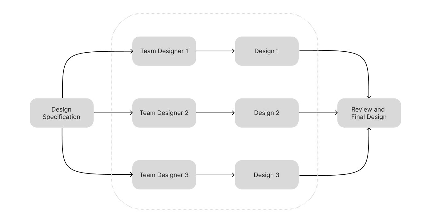
We followed the Double Diamond framework to guide our work — exploring the problem space thoroughly before moving into solution mode. Our goal was to improve the user experience while building a process that fit both the team and project needs.
We experimented with different user-centered strategies, ran parallel design sprints, and involved team members at every step. This collaborative and iterative approach helped us move faster while keeping quality high.
By staying focused on real user needs and working closely across teams, we delivered a product that was not only functional and scalable — but also enjoyable to use.

Parallel Design Phase
Where We Focused
To meet Okala’s goals and solve user pain points, we defined a few key focus areas that shaped every part of the redesign:
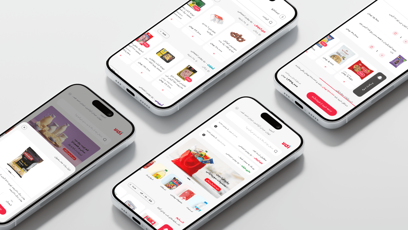
Homepage Redesign
- Simplified layout to reduce confusion
- Removed dead ends and extra steps
- Clear visual cues to reduce reliance on the back button
Improved Usability
- Streamlined navigation
- Reduced friction across key user flows
Modern Look & Feel
- Updated UI to match Okala’s new brand identity
- Aligned with modern design standards
Scalable Design System
- Built reusable components for future features
- Supported fast iteration and consistency
Growth & Retention
- Balanced new-user onboarding with features that kept existing users engaged
Product Card Enhancements
- Clearer “Add to Cart” button and better content hierarchy
- Quick-view for product details without leaving the page
- Smooth animations for a more delightful experience
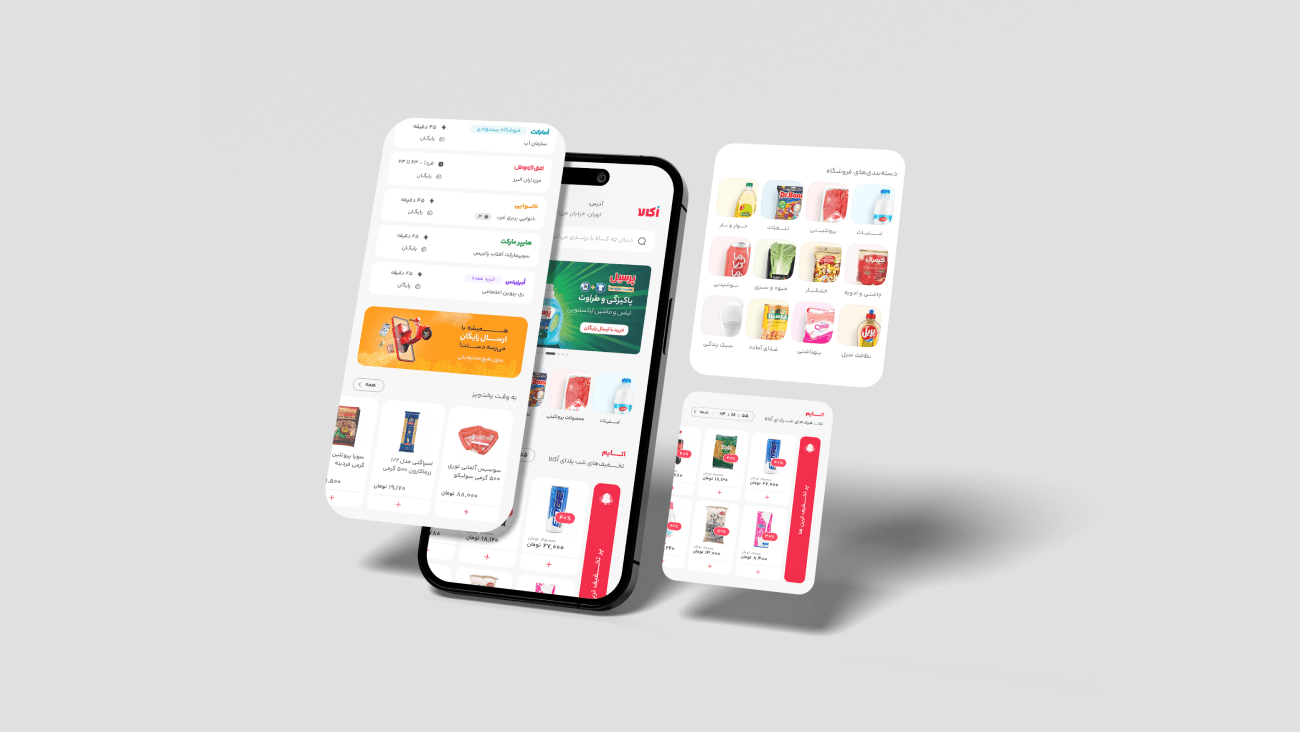
Improving the Homepage Experience
Users often felt lost in the app — unclear navigation and too many dead ends made the experience frustrating. We redesigned the homepage and checkout flow to fix that.
What We Did:
Removed extra steps and dead-end paths to make the journey smoother
Improved visual cues so users didn’t rely on the back button
Redesigned the flow with a focus on increasing conversion and “Add to Cart” rates
What Changed:
- Higher conversion rates
- Better user satisfaction thanks to a smoother flow
- Increased engagement with users spending more time in-app
- The new experience helped users move effortlessly from browsing to purchase — and it showed in the numbers.
Results & Achievements
The redesign had a major impact on both user experience and business performance. By tracking behavior, running usability tests, and staying data-driven, we hit key goals and solved long-standing UX issues.
Highlights (in first 3months):
✅ +30% user engagement in the first month
✅ +2.1% increase in conversion from login to order
✅ +1.6% more orders per customer
✅ Back-button issue resolved, reducing dead ends
✅ Near 100% satisfaction in user feedback
✅ Scalable design system set the stage for faster future updates
✅ Strengthened market position with improved retention and a more modern, intuitive experience
Note: Due to company policies, detailed process insights and internal data are not publicly shared but can be provided upon request in a professional setting.