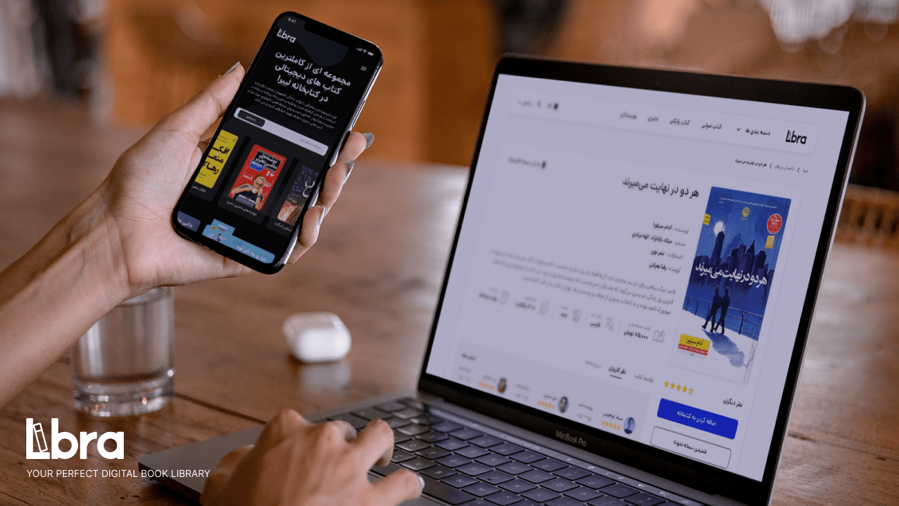
Libra is a modern book-reading app built for Iranian users, combining PDF and audio books in one smooth, accessible experience. Our goal was to design an app that feels easy for everyone — whether you’re a casual reader or a book lover.
We focused on clean design, simple navigation, and thoughtful details to make reading more enjoyable. By putting users at the center, we created an interface that’s easy to use, visually clear, and tailored to local needs — helping more people discover and enjoy reading, anytime and anywhere.
My Role
- Lead Product Designer
Credits
- Company - Areion Design
The Challenge
Designing Libra came with a set of unique challenges — especially when it came to understanding and designing for Iranian readers.
- Understanding local reading habits: We needed deep insights into how Iranian users read, both digitally and traditionally.
- Cultural relevance: Language, tone, and content had to feel natural and culturally familiar.
- Diverse user base: We aimed to include voices from different age groups, education levels, and reading preferences.
- Balancing feedback: With input from surveys, interviews, and tests, we had to find clear patterns to guide design decisions.
- Privacy & trust: Ensuring data privacy and gaining user consent was key to building trust during research.
Despite these challenges, our research gave us the clarity we needed to design a reading experience that felt local, inclusive, and easy to use.
The Solution
To handle Libra’s complex challenges, we followed the Double Diamond framework — allowing us to explore deeply, define clearly, and iterate with purpose. This structured process helped us stay user-focused while balancing project goals.
Research Highlights
Competitive Analysis:
I reviewed both local and international reading apps — comparing UX for new vs. returning users and analyzing negative reviews to spot gaps and opportunities. This shaped both design direction and business strategy.
User Interviews:
Through 6 qualitative interviews, we uncovered shared frustrations and key needs in digital reading apps — helping us prioritize features and simplify the experience.
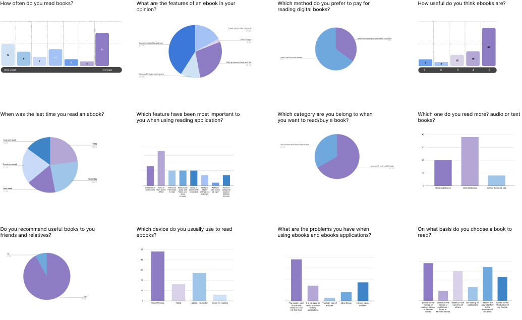
Surveys:
We gathered insights from 100+ users to understand broad behaviors and preferences. Surveys gave us a wider perspective, while interviews helped us go deeper. Together, they balanced depth and scale — and helped reduce bias.
Personas:
Based on the research, I created three user personas that reflected the needs of a broader audience. Their journeys were mapped across product phases, revealing design and communication opportunities at each step.
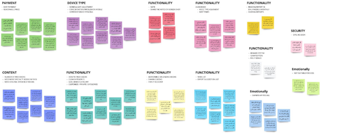
Affinity Mapping:
To make sense of all the insights, we organized feedback using affinity mapping — clustering key themes and uncovering patterns that could inform design decisions. We also explored audiobook behavior through casual chats, and found many users appreciated having reading and listening options in one place.
Problem Statement & Ideation
Based on user research, personas, and empathy mapping, I defined the core problem using a simple framework:
[User] needs [something] because [insight].
In Libra’s case, users needed a digital reading experience that felt friendly, usable, credible, and accessible — one that matched their lifestyle, habits, and motivations.
From this, we identified key solution areas:
- Personalized book suggestions
- Tracking reading time
- A supportive reading community
- Daily challenges to build habits
Once the core needs were defined, we entered the ideation phase. The team explored a wide range of concepts through brainstorming, sketching, and rapid prototyping. No idea was off-limits — this was about turning insights into tangible solutions we could test and refine.
Design & Prototyping
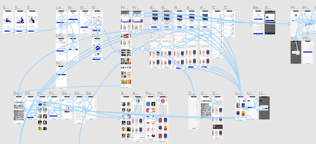
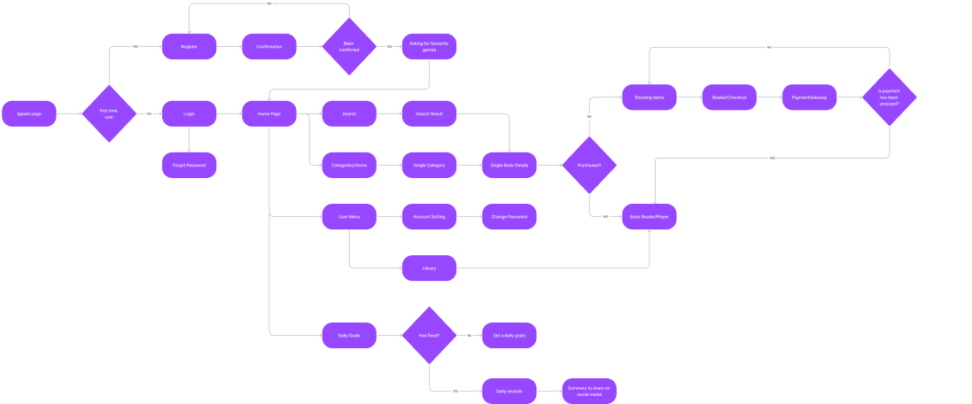
User Flow
Using insights from research, I mapped out a simple user flow to define the core MVP tasks — from discovering a book to tracking progress and joining the community.
Wireframes
With the flow in place, I started sketching low-fidelity wireframes on paper, then translated them into digital mockups. This helped us quickly test layout ideas and structure the user journey.
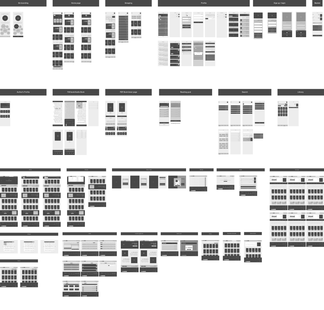
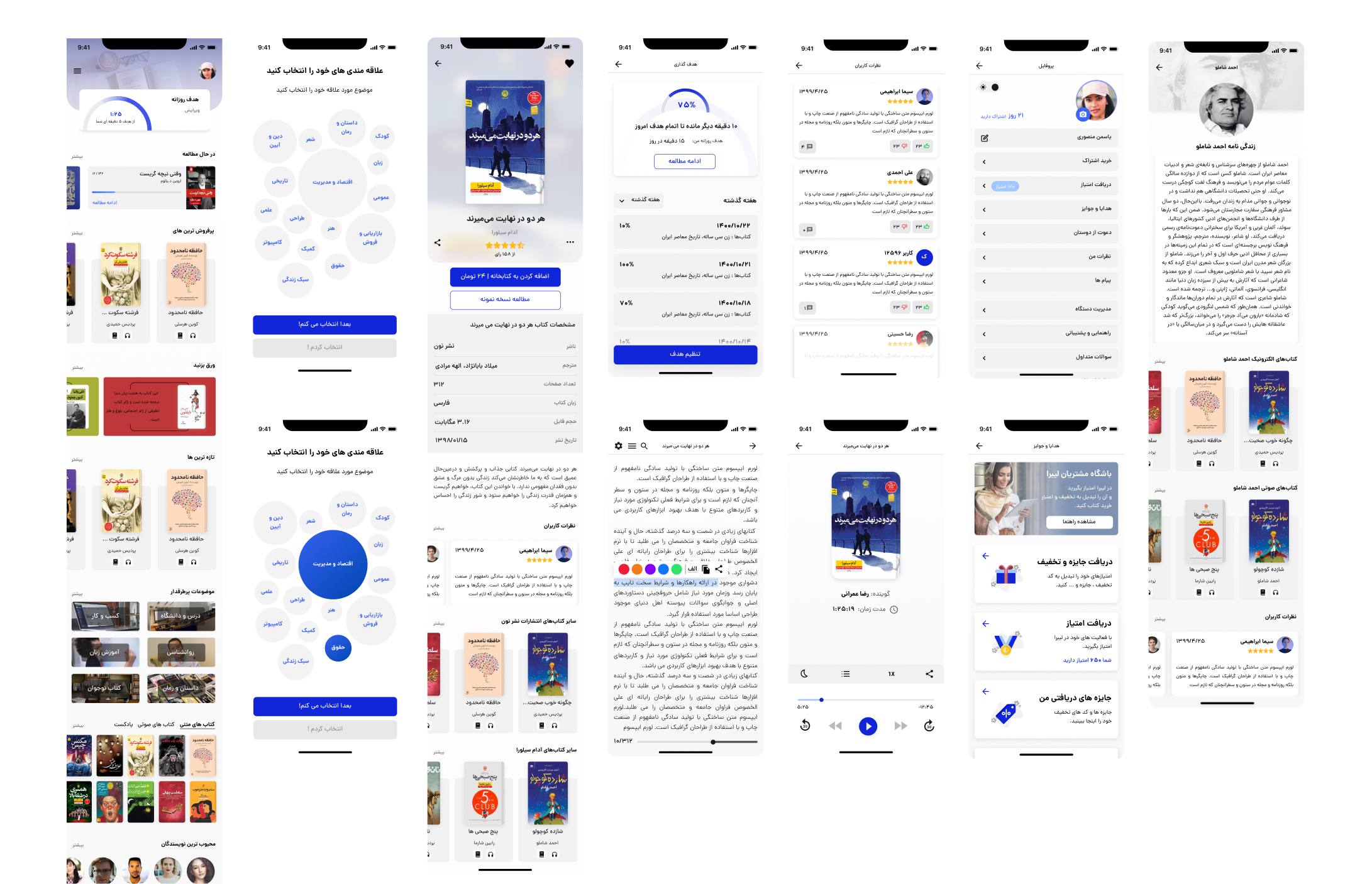
High-Fidelity UI
Once the structure was validated, I designed key screens in high fidelity. I focused on typography, color, and visual clarity, building a simple UI Style Guide to keep things consistent.
Clickable Prototype
The final designs were linked into a clickable prototype in Figma, complete with animations. This version was tested with early users to gather feedback before moving into development.
Validation & Testing
Once the prototype was ready, we moved into testing — aiming to understand how well it met user needs and where we could improve.
We ran walkthrough sessions where users interacted with the new flow, followed by observations and a simple scoring questionnaire (1–10) to measure clarity and feature success. We also extended testing to stakeholders, the internal team, and select users who had previously agreed to give feedback.
The results were encouraging:
- Stakeholders could finally “touch” and experience the product
- Assumptions were tested and refined within two weeks
- Early user feedback confirmed that the new flow was intuitive and aligned with their expectations
This stage gave us the confidence to move forward and prepare for release.